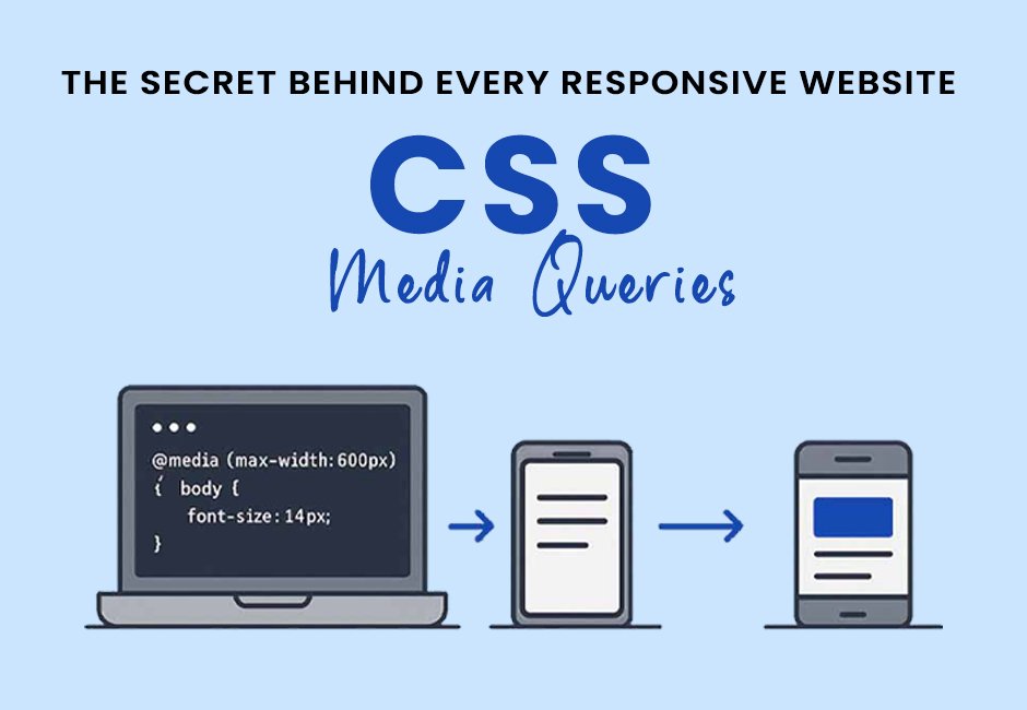
CSS Media Queries : The Secret Behind Every Responsive Website
Why Does a Website Look Perfect on One Device but Break on Another?
Have you ever opened a website on your phone and wondered why everything fits perfectly, but when you rotate the screen or open it on a tablet, the layout changes automatically?
That's not magic—it's CSS Media Queries.
Whether you're building a landing page, an eCommerce website, or a dashboard, understanding media queries can save you hours of frustration and make your websites look professional on every screen.
Let's dive in.
What Are CSS Media Queries?
Media Queries allow you to apply different CSS styles depending on the user's screen size, device orientation, or resolution.
Instead of creating multiple websites for different devices, you create one responsive website that adapts automatically.
Basic Syntax
    @media (max-width: 991.98px) {
        .container {
            padding: 20px;
        }
    }
This means:
"Apply these styles only when the screen width is 991.98px or smaller."
    @media (max-width: 575.98px) { }

    @media (max-width:767.98px){ }

    @media (max-width:991.98px){ }

    @media (max-width:1199.98px){ }

    @media (max-width:1399.98px){ }
Why Does Bootstrap Use .98px Instead of Whole Numbers?
You might wonder why Bootstrap doesn't simply write:
max-width:576px;
Instead, Bootstrap uses:
max-width:575.98px;
This prevents overlap between adjacent breakpoints.
For example:
max-width:575.98px
ends exactly before
min-width:576px
This tiny difference avoids conflicting styles.